Traditional and Modern side by side
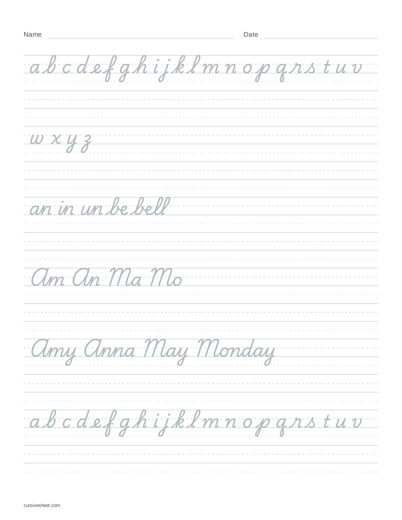
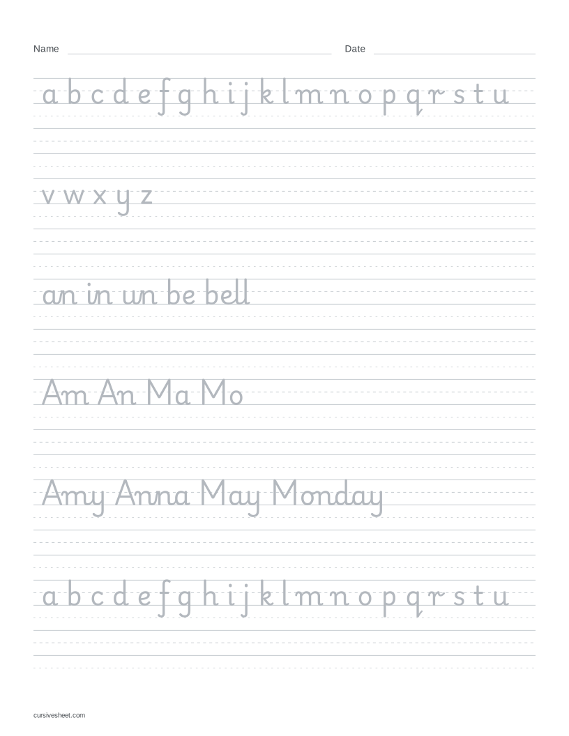
Traditional uses Playwrite US Trad; Modern uses Playwrite US Modern. Each column shows the same letters, pairs and words in its named font. These reference charts stay fixed when you change Style in the maker above.
- Loops: Traditional b has a tall loop. Modern b has an upright stem without that tall loop; compare the same letter in be and bell.
- Slant and shape: in an, in and un, Traditional leans to the right while Modern is more upright. Modern r has a more upright stem, and its s is more open than the narrow, sloping Traditional s.
- Lowercase breaks: Traditional connects b to e in be and bell. Modern leaves a visible gap between those letters. Both fonts connect an, in and un.
- After capitals: Traditional joins A to m or n in Am and An, and M to a or o in Ma and Mo. Modern leaves a gap after A and M in these pairs and in Amy, Anna, May and Monday. These examples do not describe every capital.
Common cursive writing styles
These names describe different writing traditions and approaches. The historical styles below are text-only introductions, not models this site can generate. The only worksheet fonts here are Playwrite US Trad and Playwrite US Modern.
Spencerian
Developed by Platt Rogers Spencer in the 19th-century United States, Spencerian uses oval-based letters with delicate shading in the lowercase.
Source: Ziller’s: Spencerian history and letterforms
Copperplate
Copperplate takes its name from writing models reproduced on engraved copper plates. Its pointed-pen forms contrast fine lines with heavier shaded strokes.
Source: Scribblers: What is Copperplate writing?
Palmer-style business cursive
Austin Norman Palmer’s business-writing manual was published in the early 20th century for practical handwriting. The model is slanted and continuous, without decorative shading or elaborate ornament.
Source: Palmer’s manual at Project Gutenberg; Primarium: US handwriting history
Italic
Italic handwriting draws on Renaissance chancery hands, later adapted by Alfred Fairbank for modern handwriting. Oval letter bodies, a rightward slant and selective joins distinguish this tradition.
Source: Society for Italic Handwriting: history
Modern simplified cursive
In the 1970s, some US educators looked back to Renaissance italic models as an alternative to looped school cursive. Simplified approaches can reduce loops and leave some letters unjoined; this is a broad grouping, not a single historical hand.
Cursive vs print
Cursive connects many letters within a word; print usually keeps letters separate. Letter shapes can change too: compare the looped Traditional b and sloping r and s above with Modern’s more print-like shapes. A cursive model can still have breaks, as the Modern examples show.
Use cursive to practice a joined model for notes or other everyday writing. Use print when a form asks for block letters, or when you want to practice separate letter shapes. For schoolwork, follow the model the learner has been asked to use. This site does not generate print handwriting worksheets.
Choose a model for your practice
Compare the examples with the learner’s school model or the handwriting you already use. Look at b, r and s as well as the gaps after capitals. Neither font is a universal “correct” or “standard” way to write cursive.
Load Compare styles to restore the starting text. Under Style, switch between Traditional and Modern while keeping the text the same; the live preview changes with the selected font. Edit the words to include letters you want to compare, then download the PDF. For matching ready-made sheets, use the two samples below.
Choose A4 or US Letter to match your paper and print at actual size or 100%. The downloadable samples are US Letter.
Looking for text to copy and paste?
For decorative cursive font styles to paste into a profile or message, use the cursive text generator.